Goals
→ Promote cycling and walking in the app through new features
→ Make cycling smarter and more automated
→ Address the primary barrier to cycling adoption: safety
My role
Product designer, with a vision for the new role cycling should play in the app. I conducted exploratory work balancing the need to integrate essential features (turn-by-turn navigation) with innovation informed by documented usage patterns.
Concept
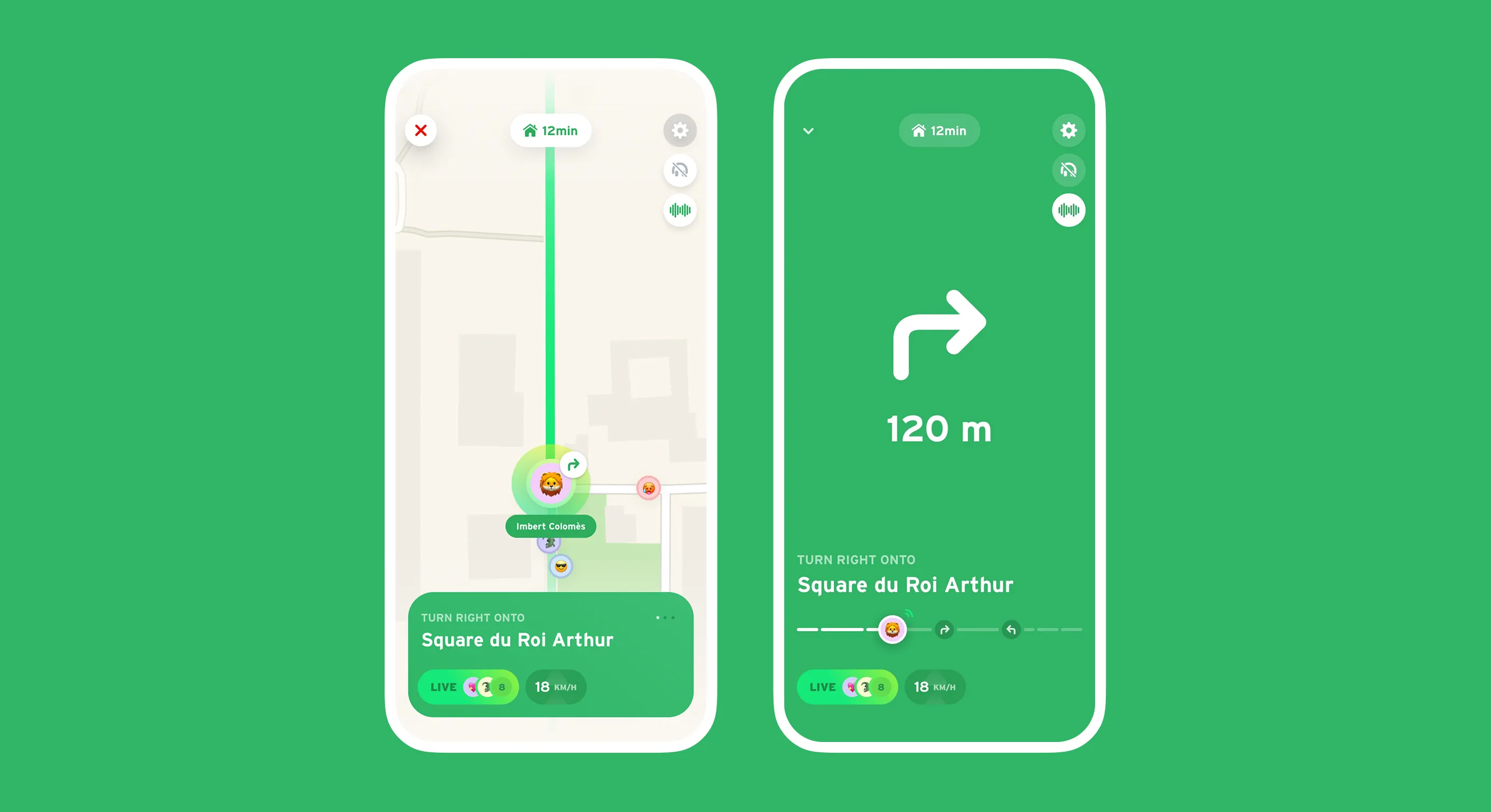
Two views explored for turn-by-turn navigation:
→ a classic map view
→ a minimalist “focus” view, designed for quick glances at the phone while cycling, with essential info and large elements.
To browse directions, the user slides the central direction — an alternative to tapping screen edges, considered too sensitive for cycling use. A timeline shows the remaining successive segments at a glance, the orientation of upcoming turns, and allows quick navigation along the entire route by sliding the avatar.
The color code distinguishes upcoming positions from the current one (purple, consistent with the rest of the app), and adapts to the service used — green for personal bikes, the service’s brand color for shared bikes.
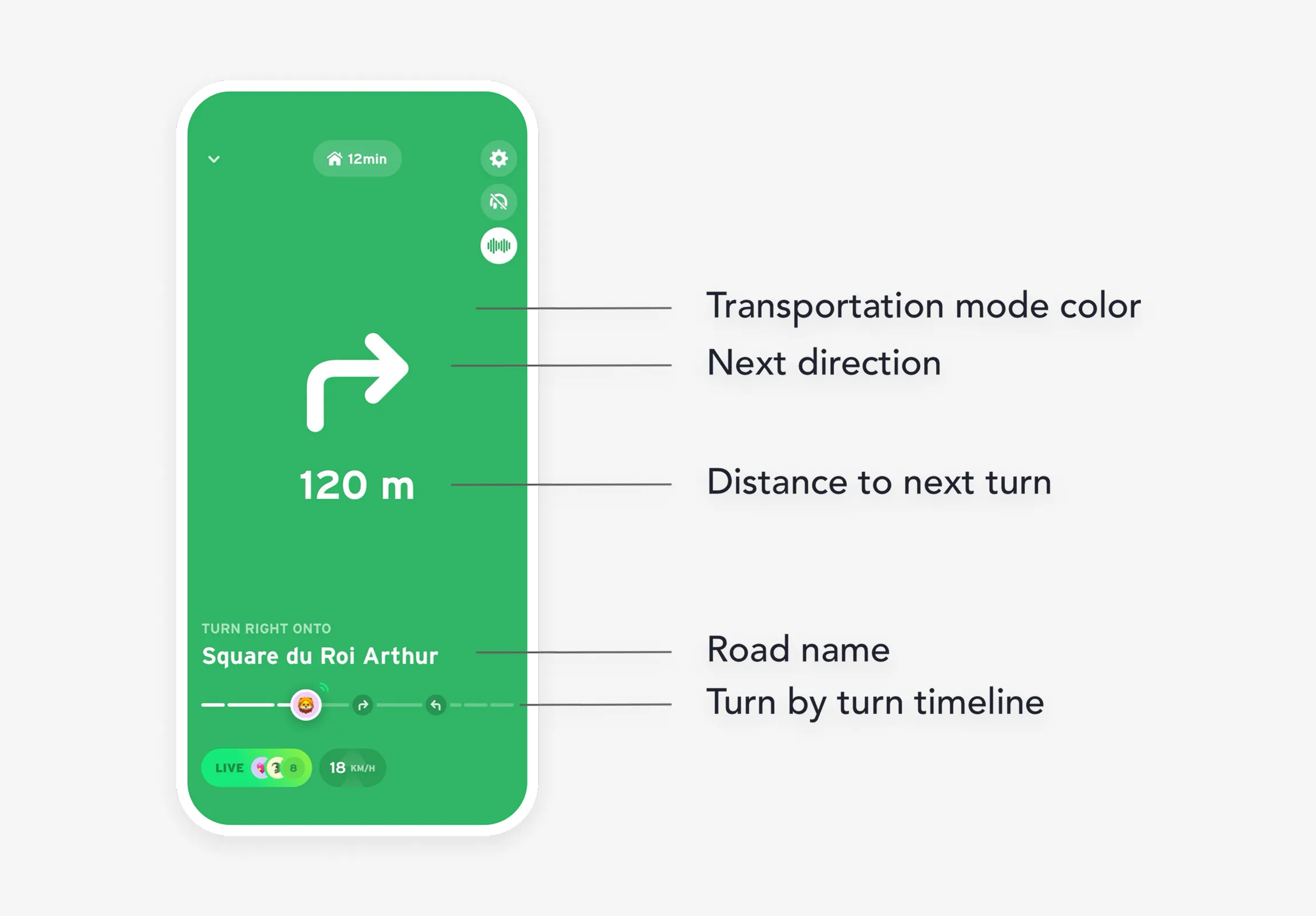
Focus Anatomy
Next Turns Exploration
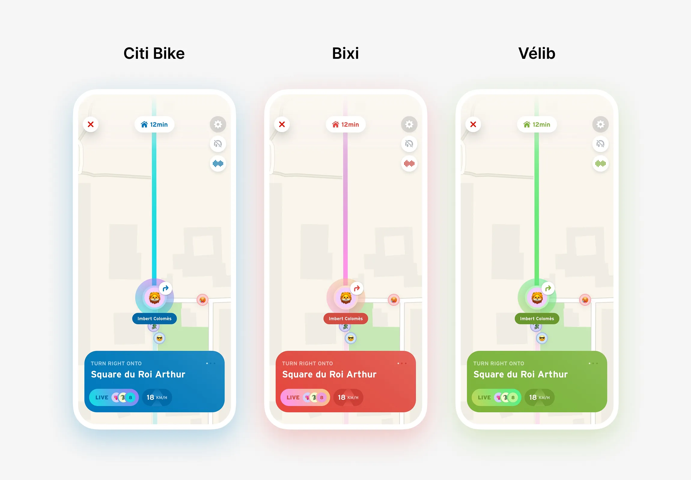
Service Variations
Explored Directions
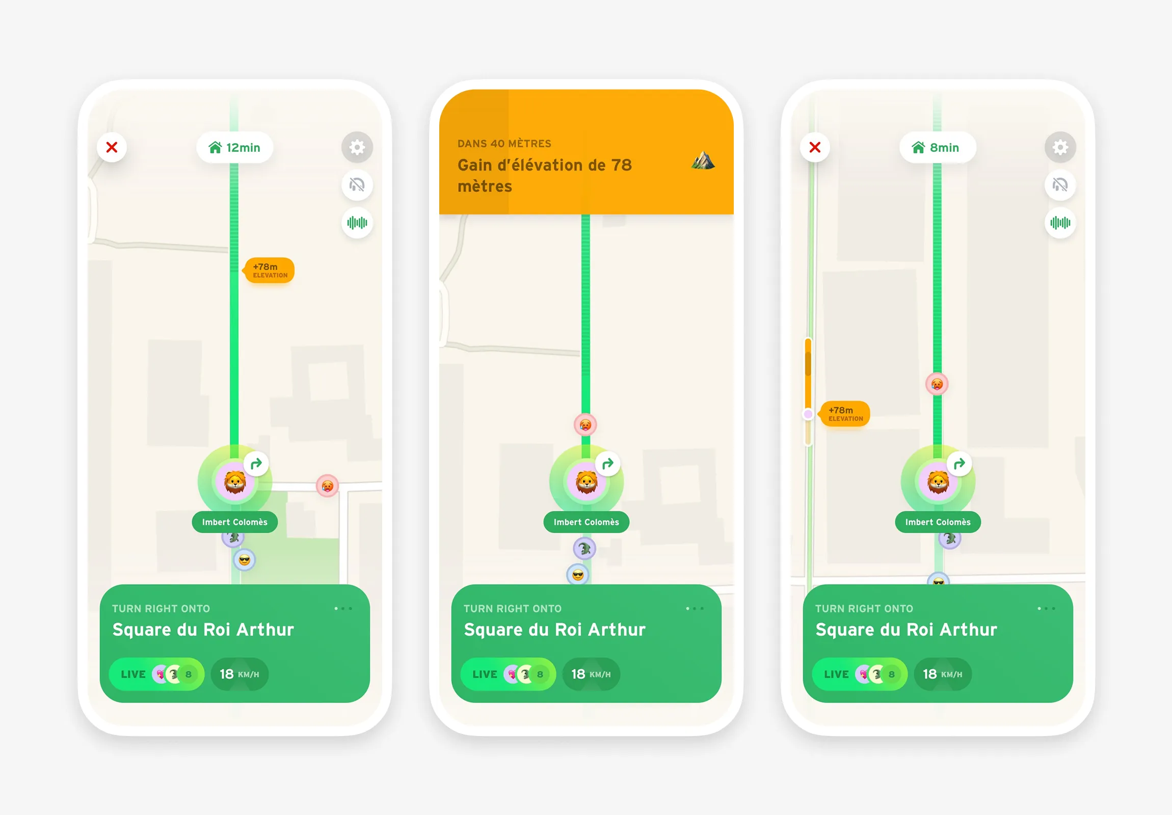
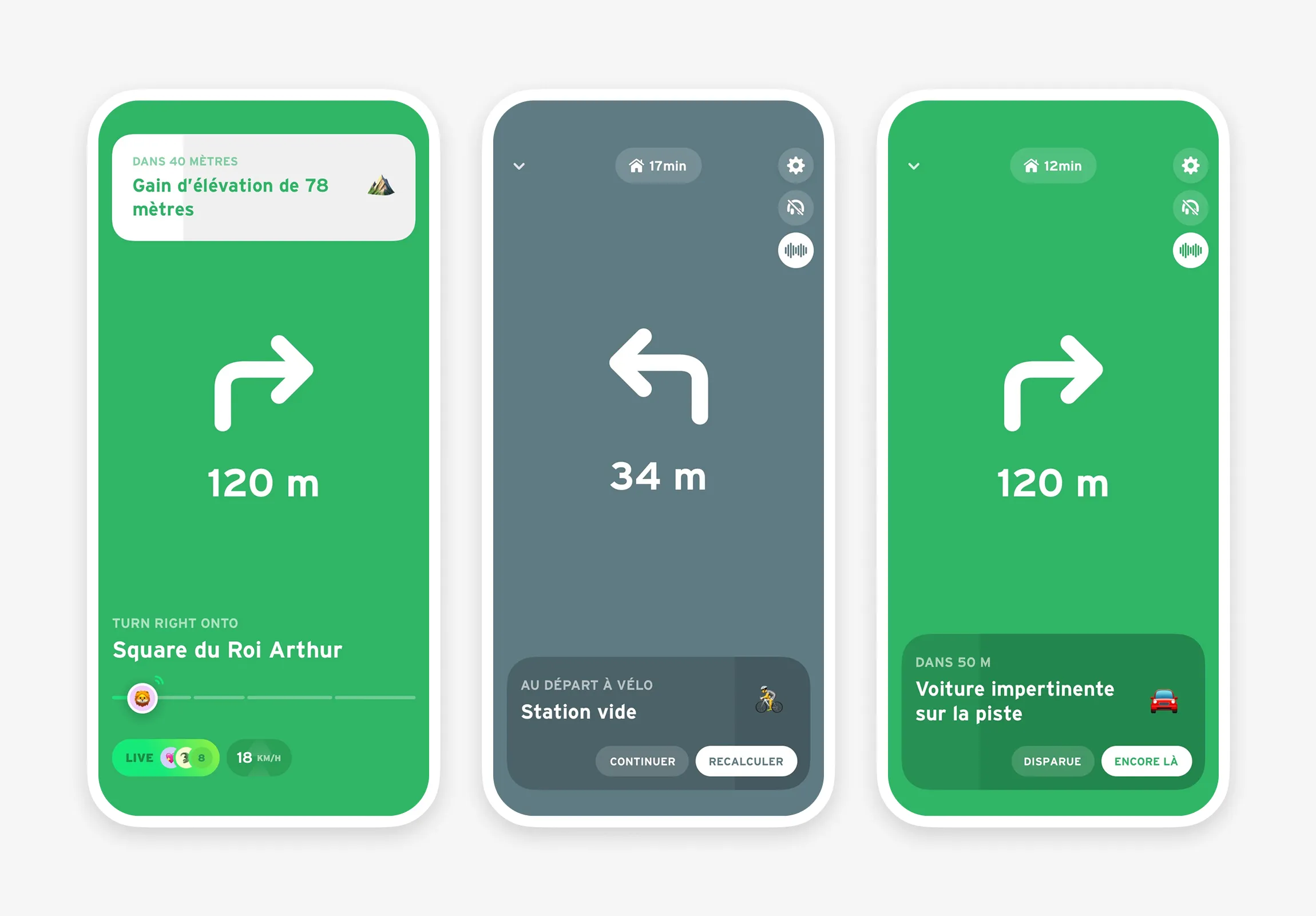
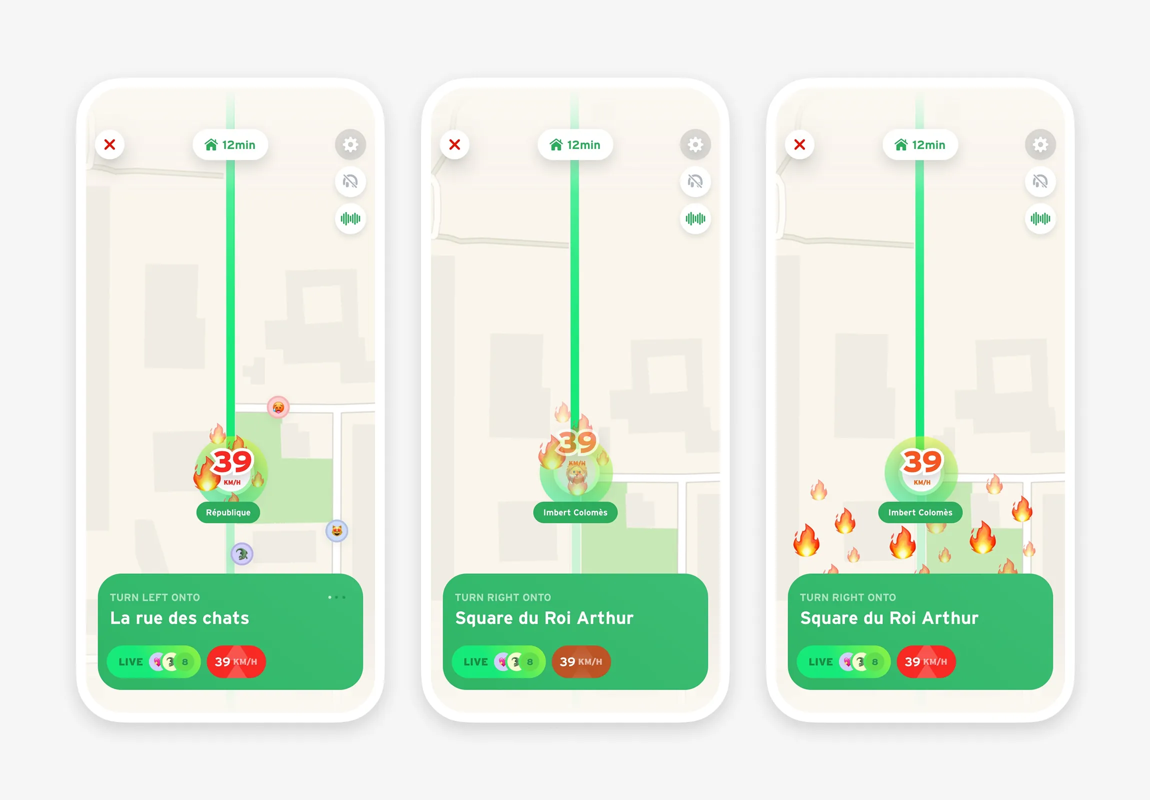
Beyond turn-by-turn: tracking indicators (elevation, incidents, rerouting when a station is empty at departure or arrival), as well as speed indicators with animations on personal records.
Then one of the central ideas that sparked these explorations: bike buses.