Context
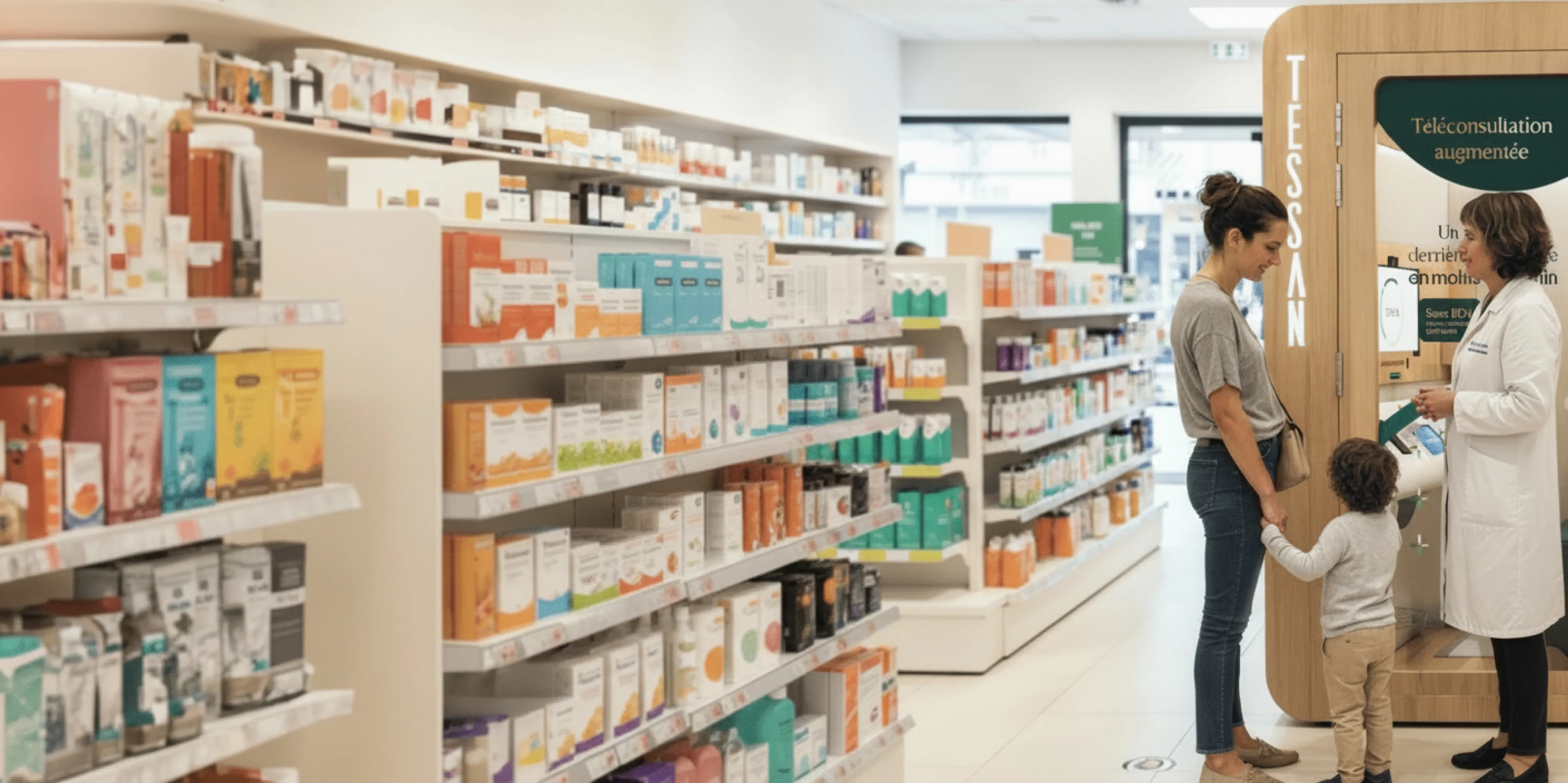
Tessan addresses a healthcare access problem: enabling medical consultations in areas where medical services are scarce, through devices deployed in pharmacies or directly at the patient’s location.
A mature product on the business side, Tessan had never been supported by a designer. Without a design system or shared reference, interfaces had drifted apart: action buttons, colors, structures, alerts with no consistent pattern. Beyond the visual layer, this drift directly impacted the patient experience as well as the cost of each new feature and its maintenance. A new brand identity, launched in the meantime on the website, had been designed for marketing rather than product interfaces — a constraint to work around, rather than a ready-made framework.
Goals
→ Unify design and development to gain consistency and agility
→ Refocus features on the user rather than the business calendar alone
→ Build versatile and scalable reference sources (visual and usage-based) to guarantee quality for every new feature
My role
Freelance product designer embedded in the product team across three parallel tracks.
→ Build the design system
Design it and drive its adoption: workshops with the product team, Storybook setup for developers, and foundational work with the engineering team to establish and grow the collaboration.
→ Advise and challenge the product team
Bring an outside perspective on feature proposals, pushing toward versatile and more user-centered solutions.
→ Design targeted solutions
Several end-to-end projects, including a critical patient orientation issue in the waiting room and a full redesign of the sign-up flow.
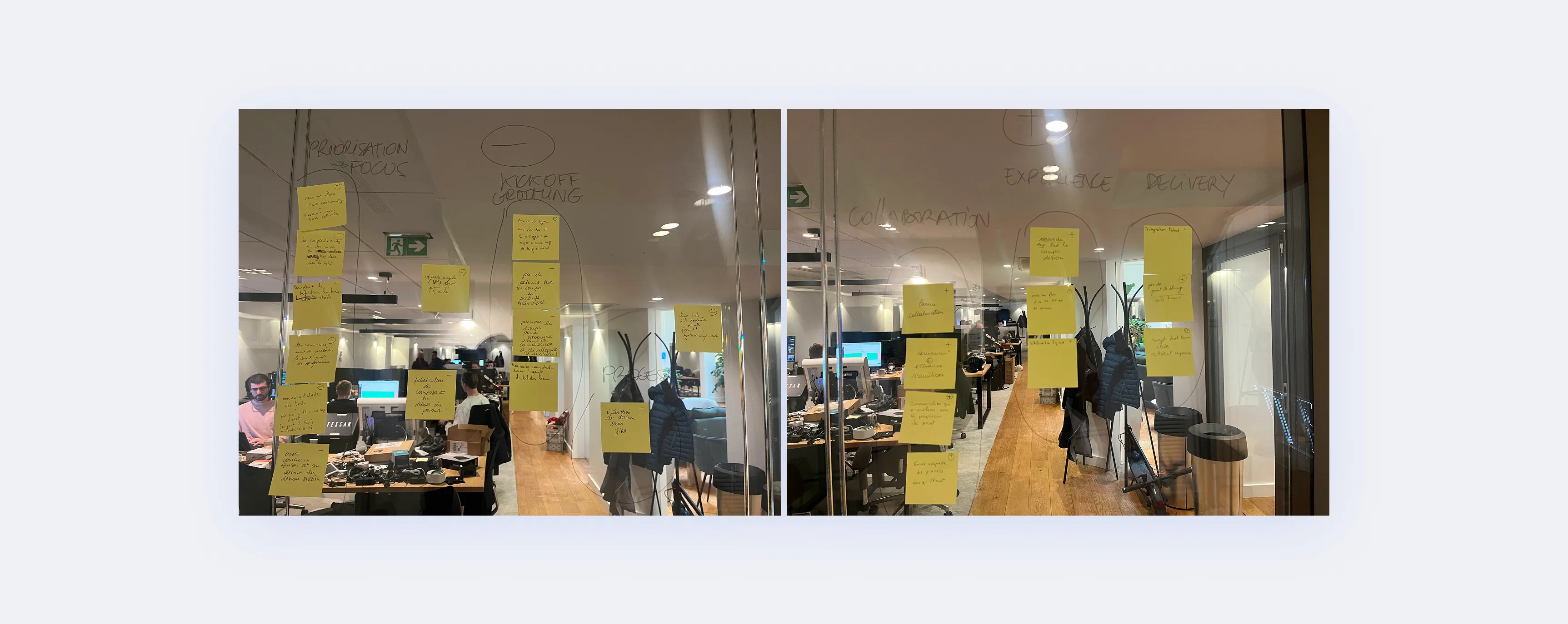
Design system collaboration retrospectives
Process
The starting point was not a product under development but an existing one already in production. A system, therefore, to be surfaced from audits of the interfaces and understanding of usage patterns.
The approach was to build components close to the existing ones, enabling fast and incremental delivery by blocks (sign-up, matching, history…). This way, new blocks could coexist with the legacy without too much disparity. Beneath this visual proximity, the structure, UI patterns and flows were extensively reworked, enabling a first round of improvements.
Beyond individual blocks, priority was first given to foundations and the most widely used components, then extended to more specific elements.
Tokens were set up early to prepare the transition to the new brand identity and ensure future consistency.
Component usage was documented directly in Figma.
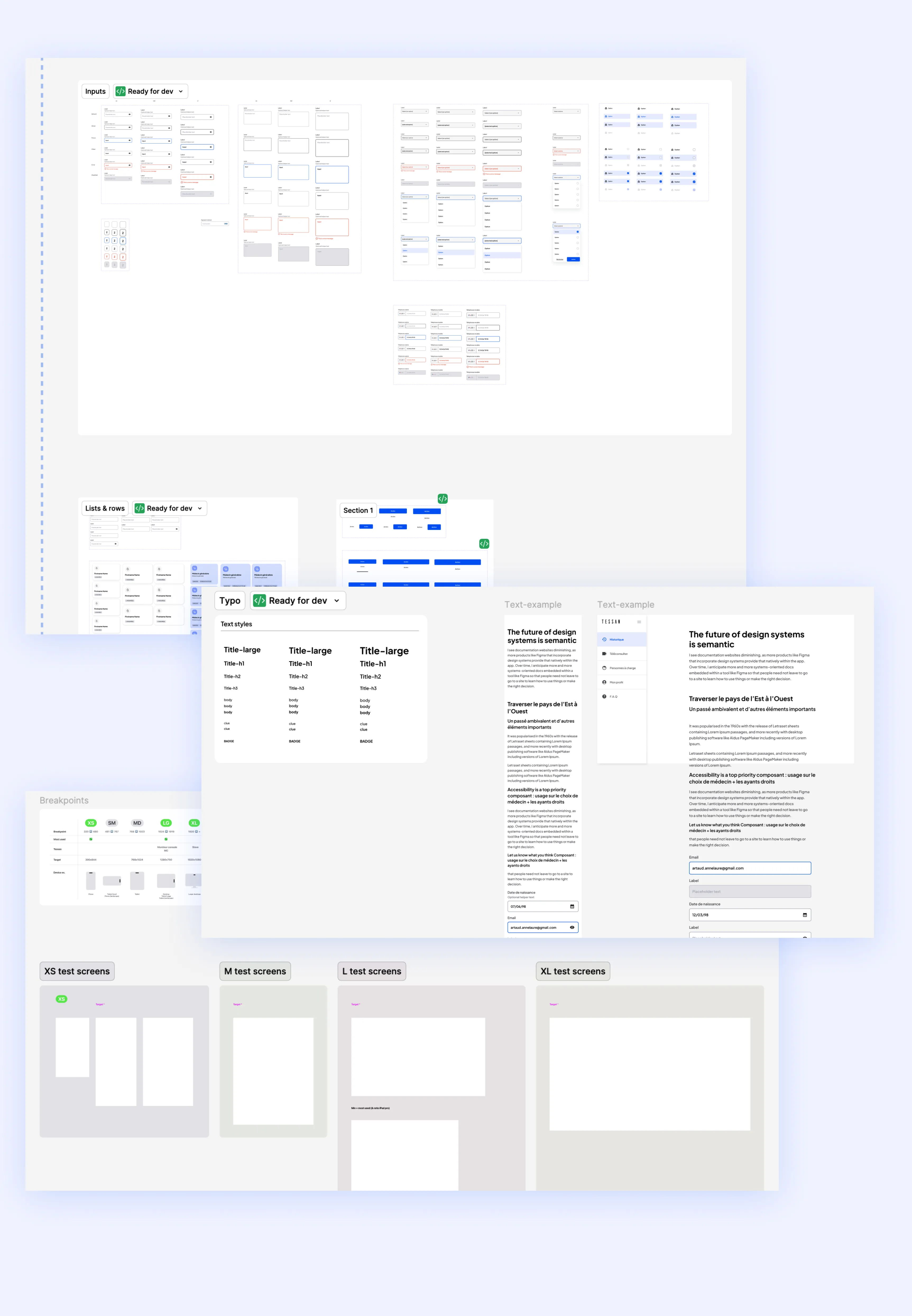
Design system excerpts
Variables
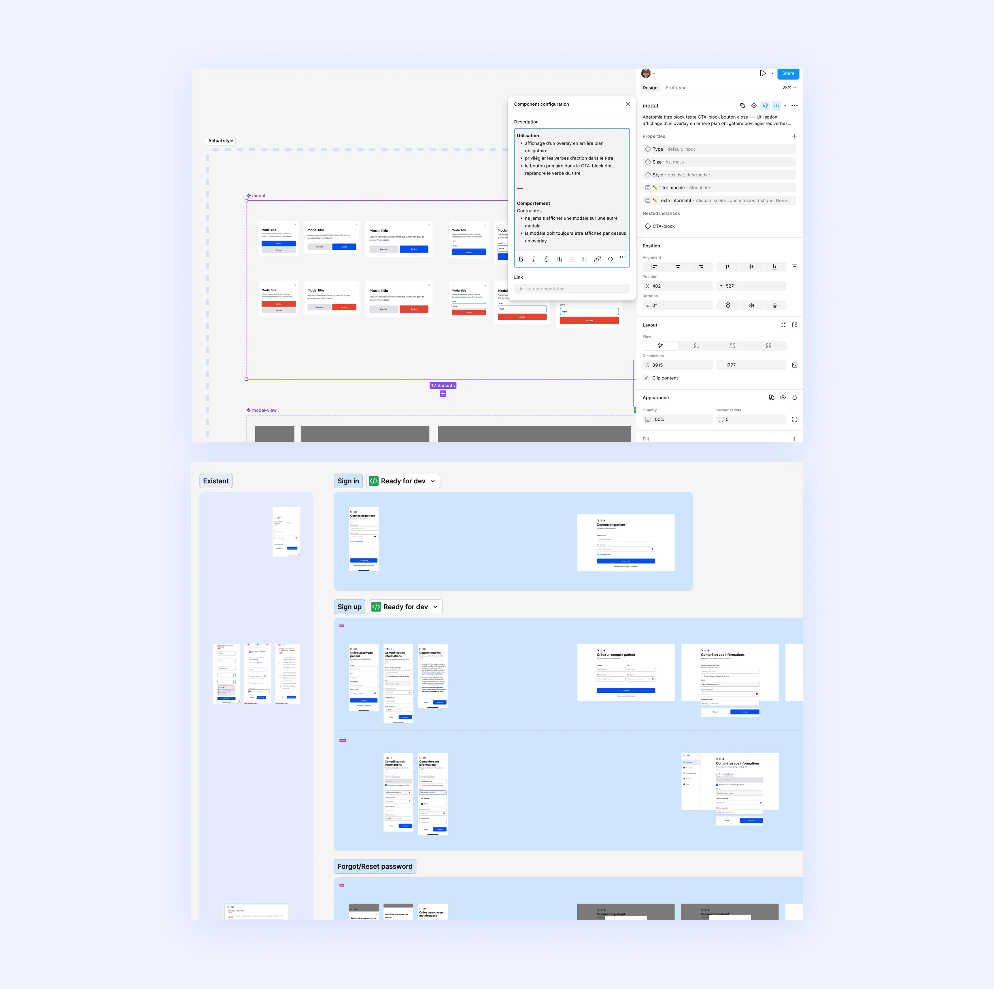
Documentation excerpt
Case studies
Matching
→ Problem
The entry point of the teleconsultation journey asks patients to choose between a general practitioner and a specialist — a poorly presented choice that regularly led patients into the wrong queue. Customer support was overwhelmed on this single issue, patients waited a long time only to leave without a consultation for lack of the right practitioner: an operational emergency more than a conversion problem.
→ Solution
Discussions with customer support, on the front line with affected patients, helped identify two concrete causes:
→ the fake appointment generated by Doctolib (used for marketing purposes) was interpreted as a real appointment, pushing patients to select “Specialist, I have an appointment”
→ when the “general practitioner” queue was full, some patients tried to bypass it through the specialist access
Redesign of the choice screen, under rapid development constraints — simple, reusable components, integrated into the design system:
→ vague title replaced by a main title and subtitle pointing toward the action
→ two distinctly colored tiles for immediate differentiation between the two choices
→ dedicated icons for each doctor type, avoiding the calendar icon used in the existing version to minimize confusion
→ “Doctolib slot” badge rather than “appointment”
→ alert badge on the specialist tile, flagging the appointment requirement with a confirmation modal
→ Results
After deployment, customer support requests related to this issue dropped drastically. The design decisions made at the component level became a starting point for evolving similar elements across the product (modals, step structure, badges…)
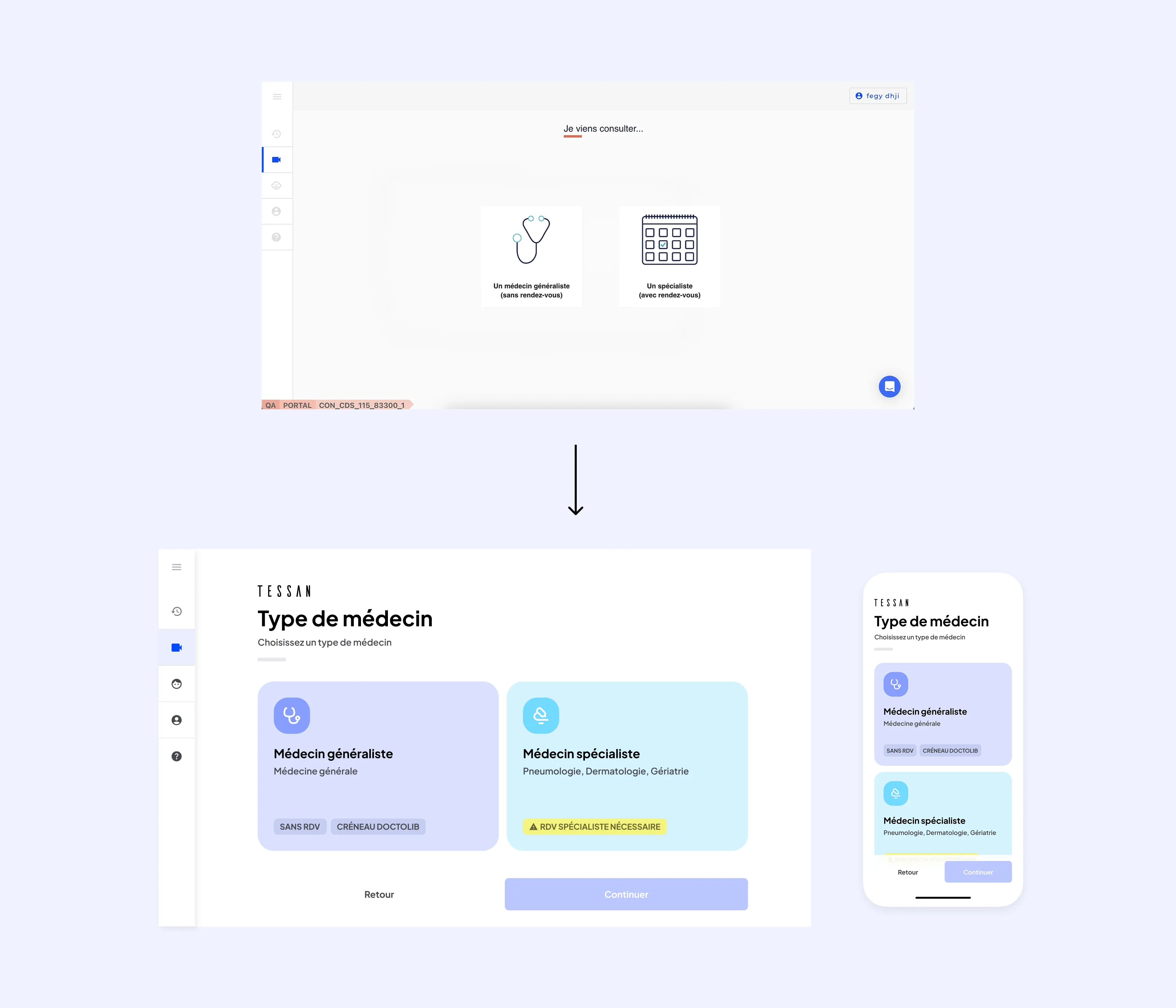
Évolution de l’écran de choix
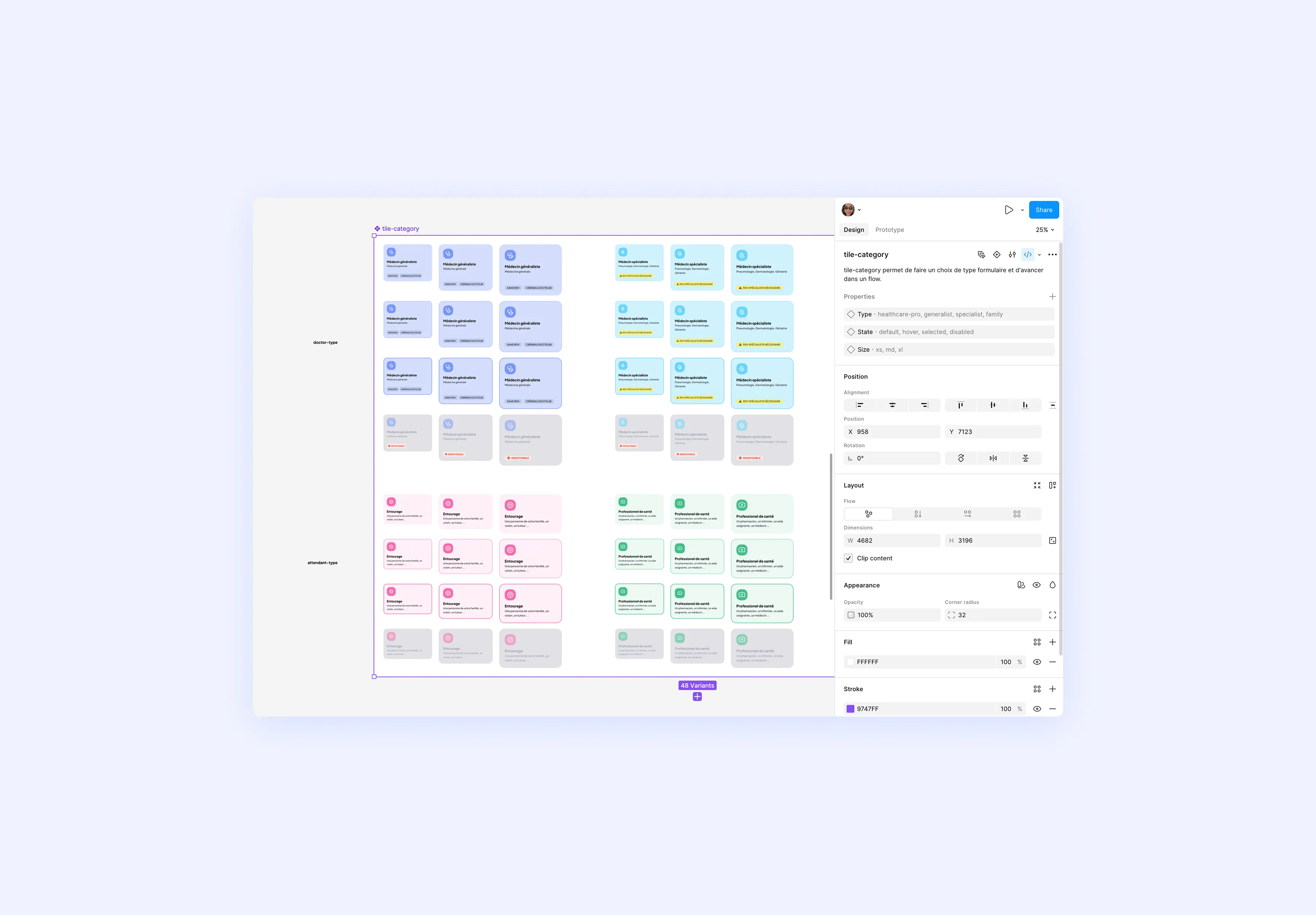
Components
Sign-up
→ Problem
The sign-up flow audit — conducted at the start of the mission — had revealed high friction at every step: too many fields per screen, unsuitable keyboard, information prioritization to rethink, choices lacking in obviousness, no clear confirmation at the end of the flow. In real-world use on booths and kiosks, where most sign-ups happen, these frictions translated concretely: drop-offs, patients unable to complete the process alone, and constant solicitation of pharmacists to assist or complete the sign-up for them.
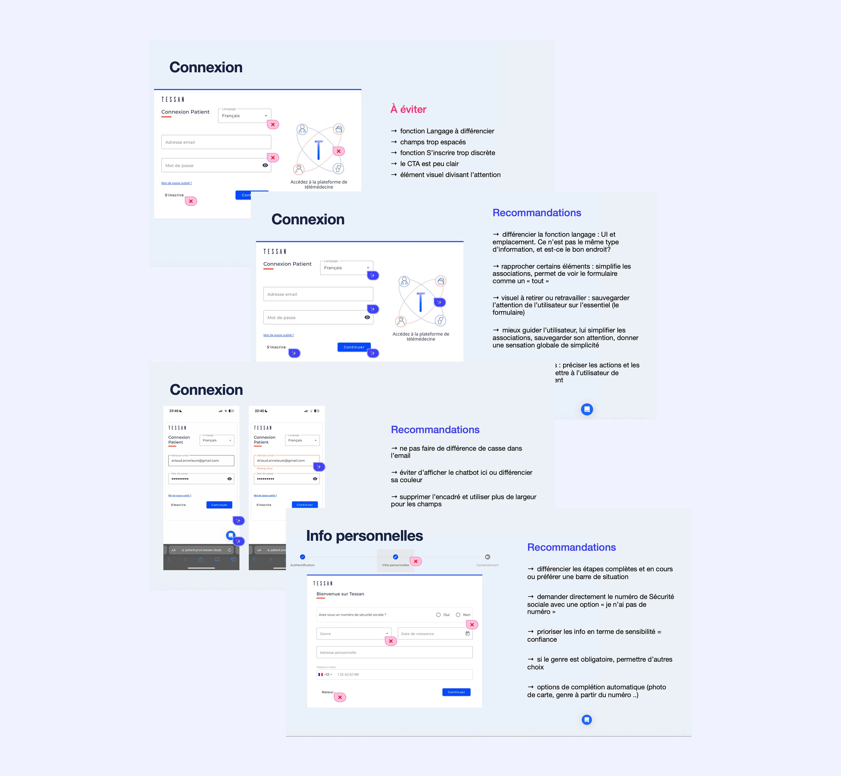
Audit du parcours d’inscription
→ Solution
A few examples of reworked areas, prioritized by criticality:
→ Form UX redesign: simplified input, clear information hierarchy, larger and more readable text for screen-distance use, adapted to booth reality
→ Complete UX writing overhaul across the entire flow — titles, subtitles, action buttons — providing the guidance that was missing and establishing a sense of trust and reliability
→ Removal of unnecessary steps, automations, clarification of choices to be made
→ Automatic login after sign-up
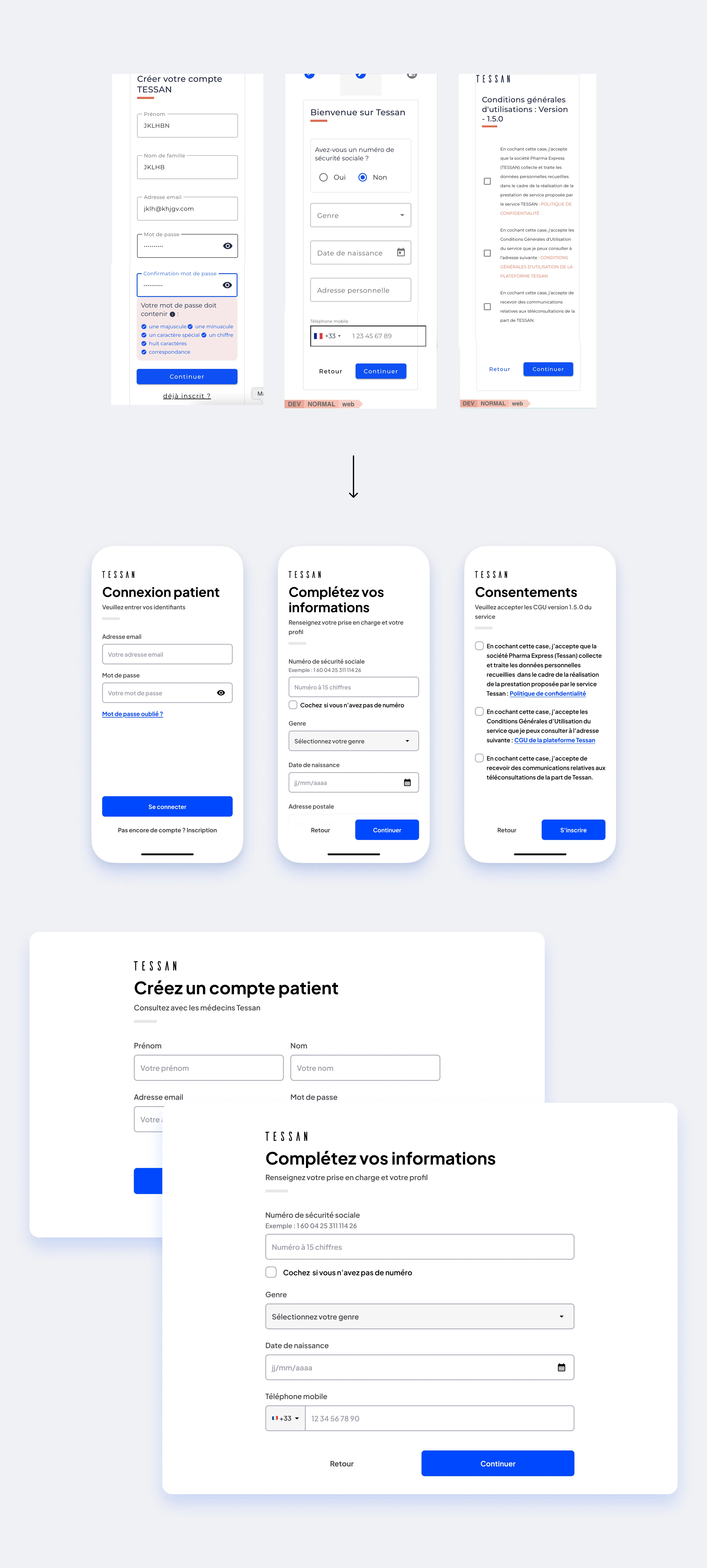
Quelques écrans d’authentification
Structure
Territoriality
→ Problem
A regulatory requirement mandated prioritizing doctors from the patient’s territory rather than all doctors available in France by default — a logic of little relevance in teleconsultation, where the practitioner’s location doesn’t matter. Restricting the default zone mechanically increases waiting time in the virtual waiting room, while the product’s promise is a teleconsultation in under 15 minutes. The challenge: comply with the requirement while giving users the means to widen their radius and get a reasonable wait time.
→ Solution
→ City selected by default — the most restricted zone, compliant with the regulatory requirement, without blocking access to wider zones
→ Concentric zones (city, region, all of France), each showing the number of available doctors and an estimated wait time
→ Visual emphasis on the widest zone via a “faster” badge
→ Modal explicitly offering to widen the zone to reduce wait time
→ Doctor list available as a complement, for choosing a specific practitioner (competency filtering remaining out of scope for this V1) — deliberately given less visual prominence than the zones
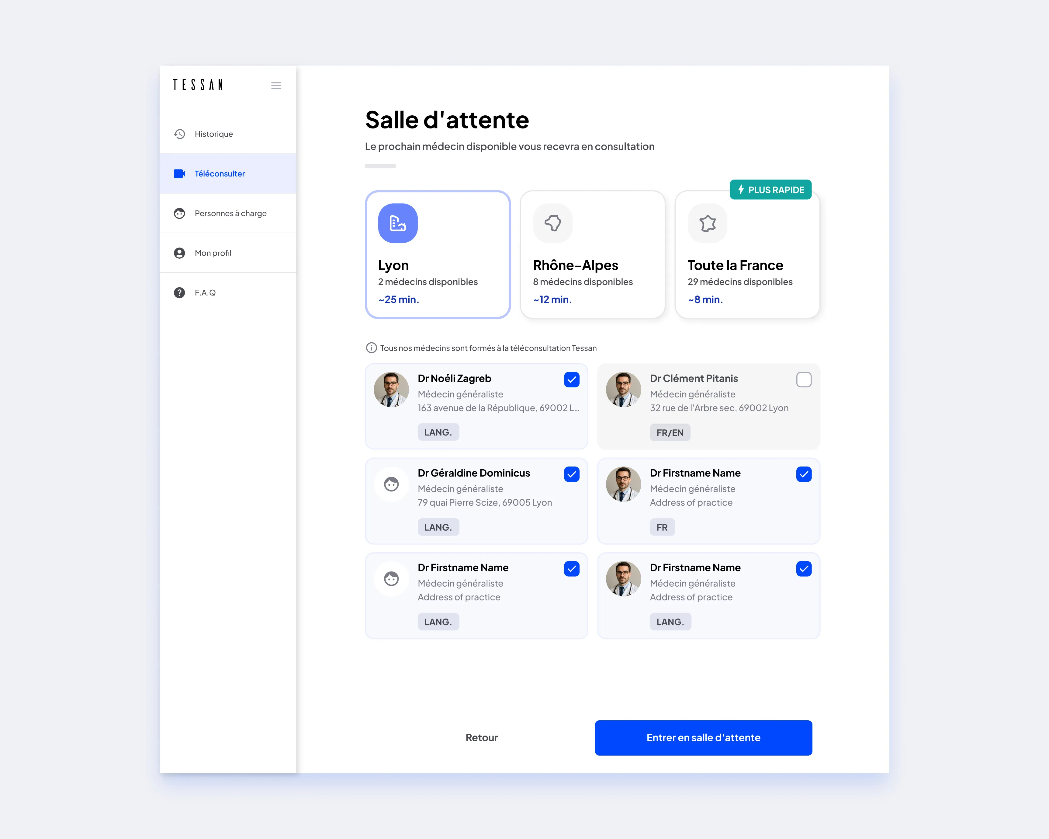
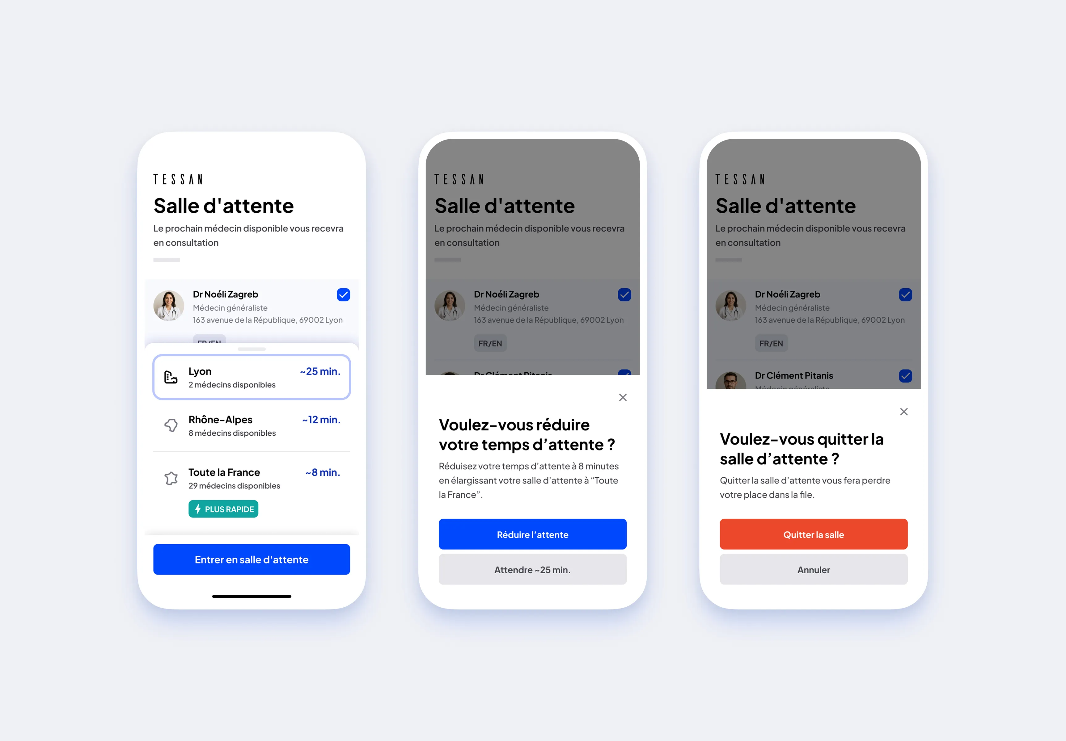
Sélection avant entrée en salle d’attente
Other projects
→ Caregiver
Some patients cannot manage their account alone — too young, too old, or dependent on a third party for the consultation: nurses using the portable kit directly at the patient’s home, pharmacists assisting a patient in a booth. A regulatory requirement mandated capturing this identity separately. Solution: a dedicated identity form for the caregiver, and a list of family roles sourced from an official health reference — originally about thirty entries — reworked and prioritized for quick patient use.
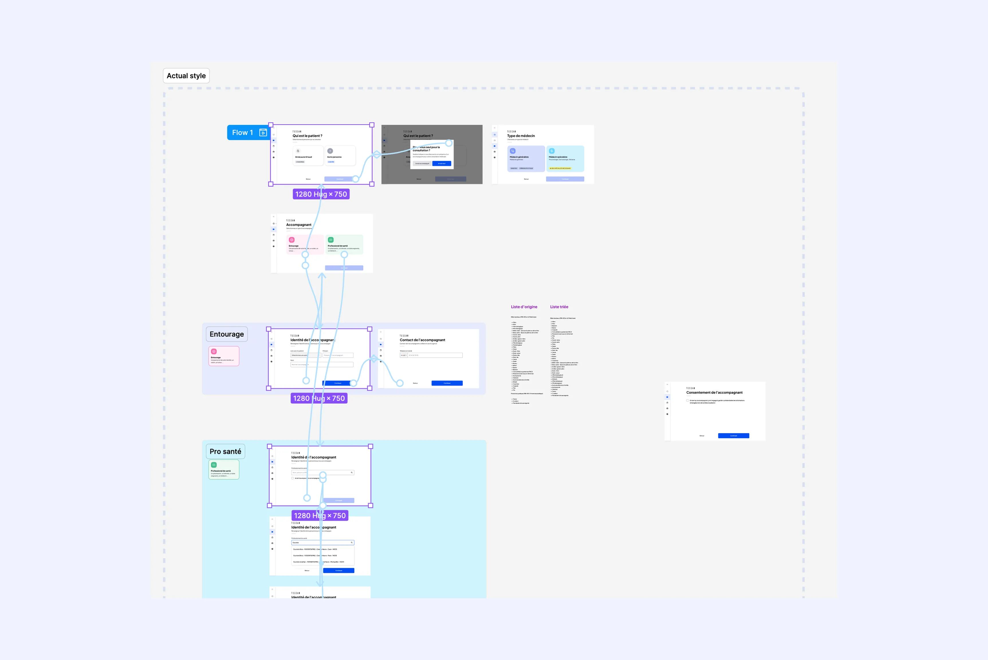
Caregiver user flow
→ Pharma locator
Two distinct needs: finding a pharmacy equipped with a booth before a consultation, or sharing a prescription with a pharmacy after a teleconsultation done elsewhere (eventually from the mobile app). Designed as an MVP, the flow combines a standalone entry (map and pharmacy list) and an entry at the end of a teleconsultation (document selection, pharmacy choice, confirmation with directions). On the pharmacist side, a prescription management interface with status filters.
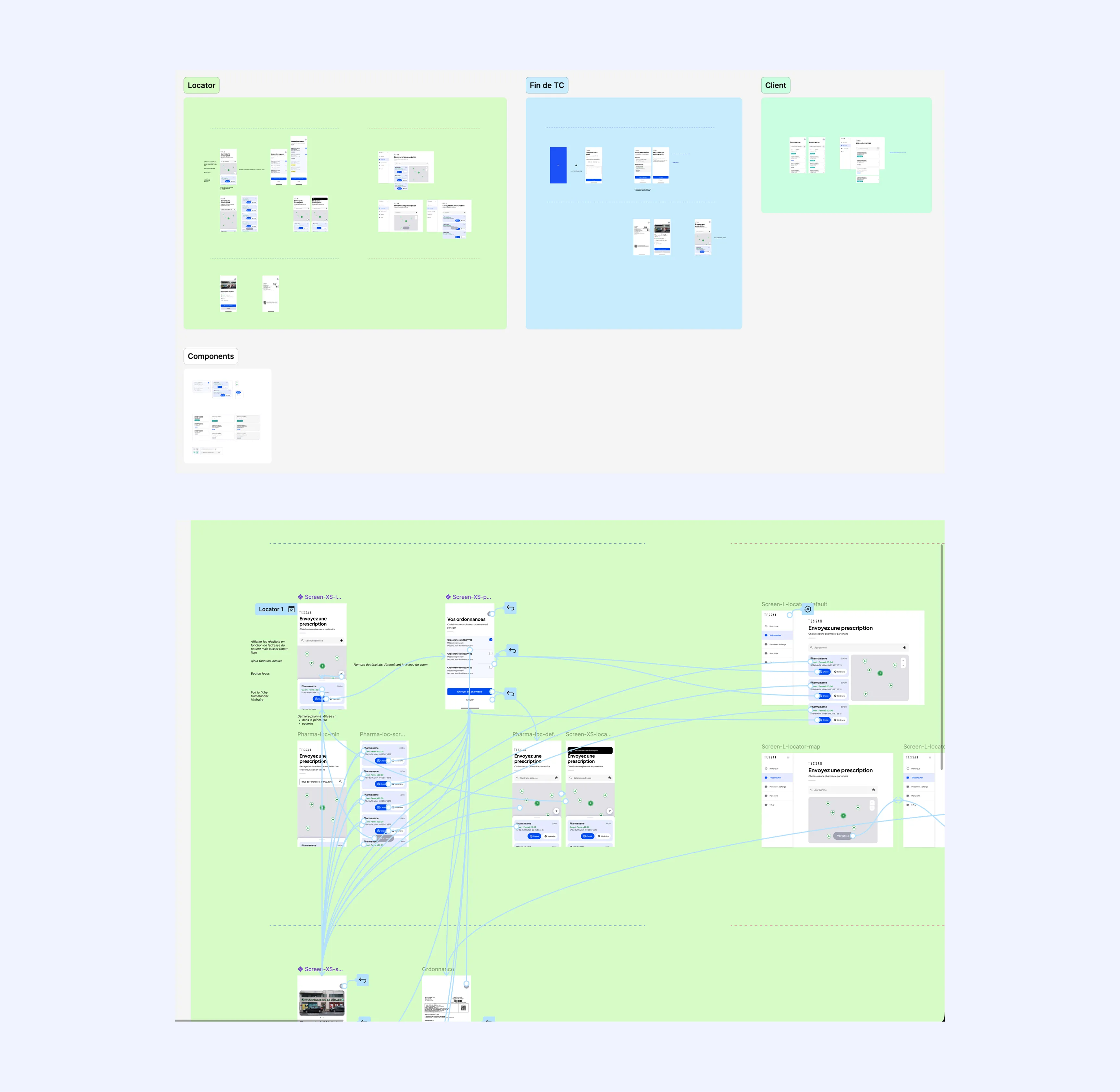
User flows
Prescription management MVP